


Ask five suppliers for a “gold” plastic tablecloth and you can receive five different colours: a dull antique gold, a bright yellow-gold, a foil-look print, or something closer to mustard. Ask for “black and white” and you may be quoted a solid black cover, a checkerboard print, or a polka-dot pattern. Colour is the first line of most party and event enquiries and usually the vaguest line on the purchase order.
This guide is written for buyers who order plastic table covers by the carton rather than by the piece. It covers the two colour families that carry the most volume in party and banquet supply – black and gold, and black and white – and then sets out how to write a colour down as a specification a factory can actually hold from one production run to the next.
Why colour, not size, is usually the first complaint
A wrong size is obvious before the event: the cover does not reach. A wrong shade usually arrives on site and looks fine in the warehouse, then fails under the venue’s lighting. By the time it is on the table, the cartons are open, the labour is spent and the return is a commercial argument rather than a logistics one. That is why colour belongs in the specification, next to size and thickness, and not in a note at the bottom of the enquiry.
The colour families that carry volume
Across party, catering and banquet orders, a small number of colourways do most of the work. Buyers who stock these first can usually cover most enquiries.
| Colour family | Where it sells | What to pin down |
| Black | Formal dinners, New Year, Halloween, bar and restaurant tables, photo backdrops | Matte or gloss finish; how black reads on a thin film |
| Antique gold | Wedding receptions, anniversaries, New Year, hospitality promotions | Pigmented film versus metallic print; light source for approval |
| White and ivory | Catering, buffets, clinics and events that want a clean base | Opacity – a white cover that is see-through is a different product |
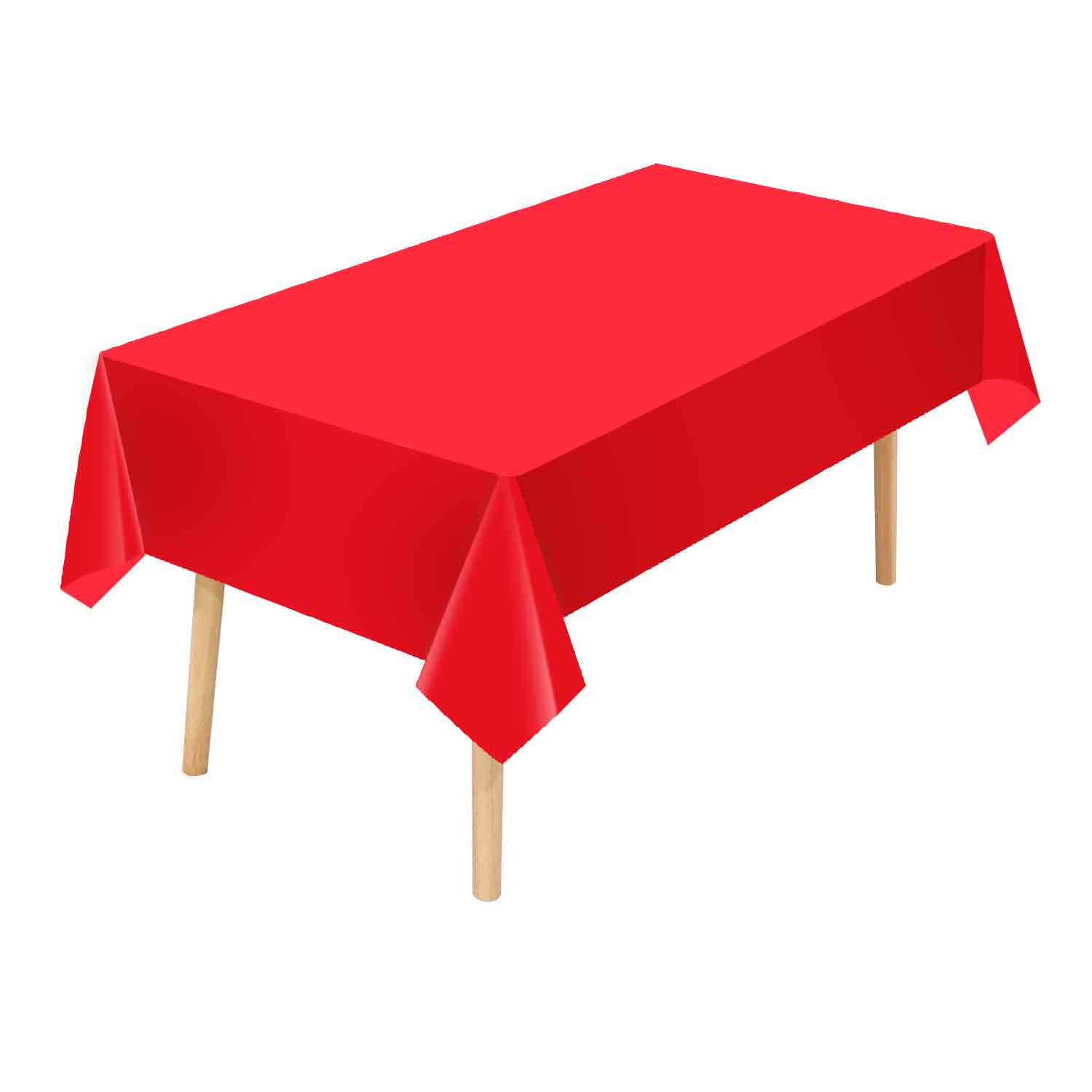
| Red | Christmas, Lunar New Year, promotions, children’s parties | True red versus orange-red; print fastness on the fold lines |
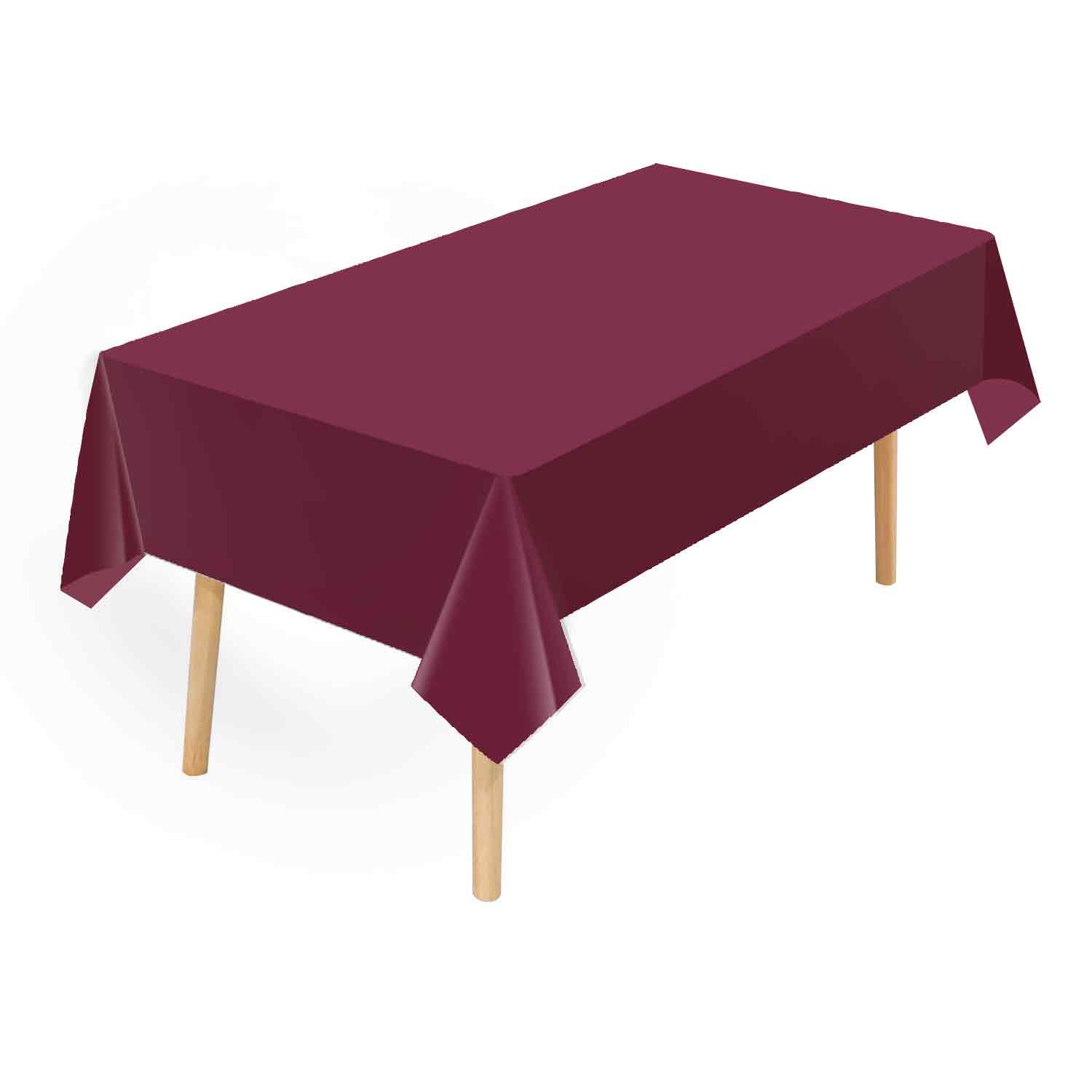
| Navy and burgundy | Hotel and banquet programmes, conference rooms | Depth of shade; consistency across repeat orders |
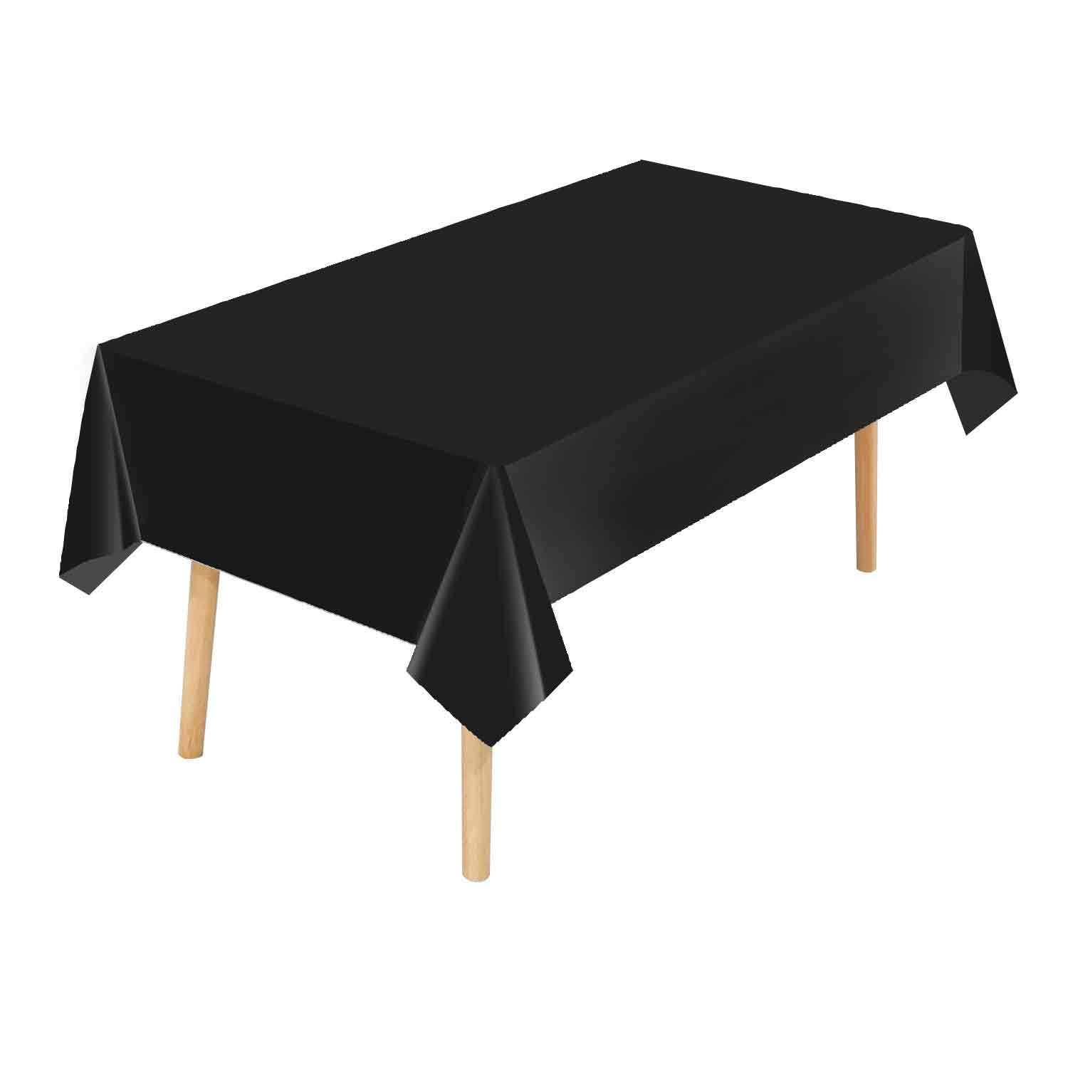
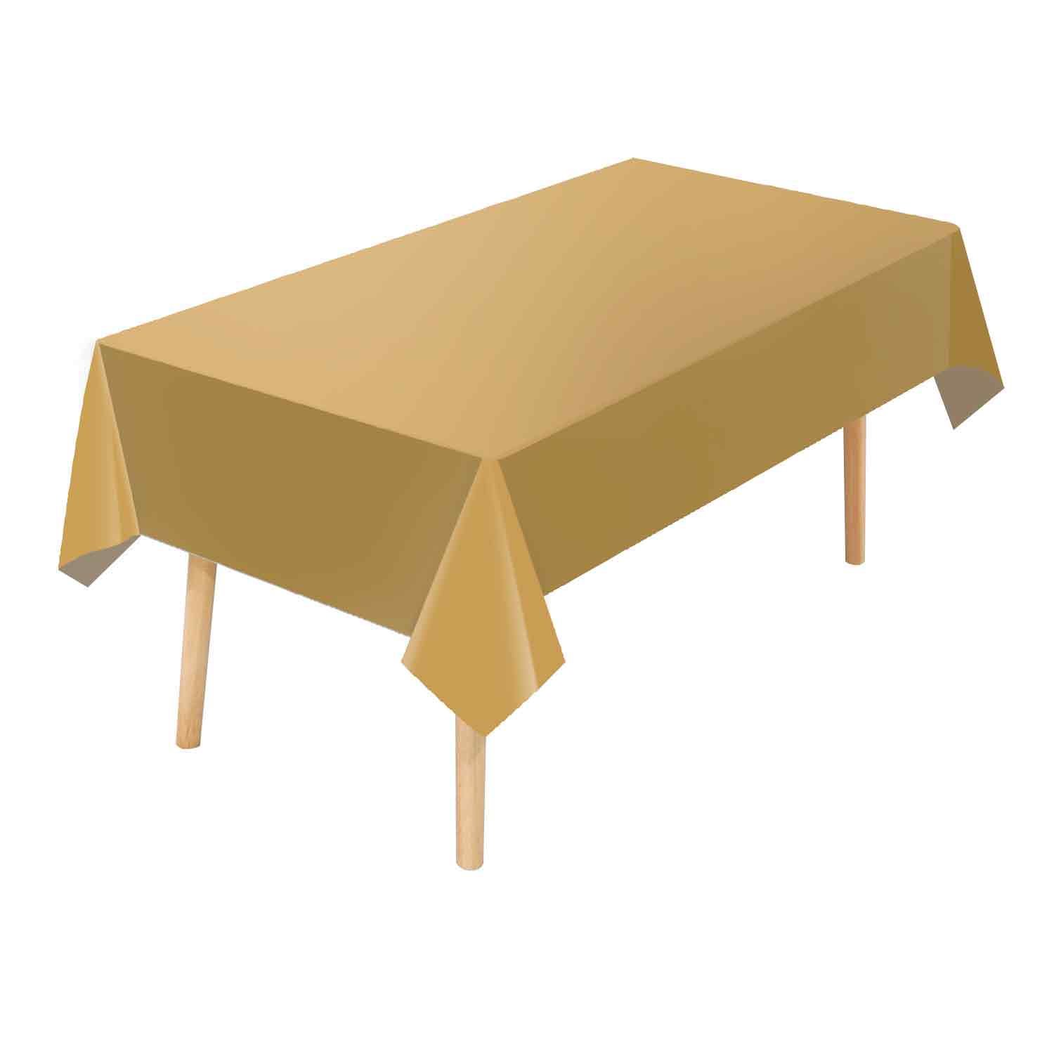
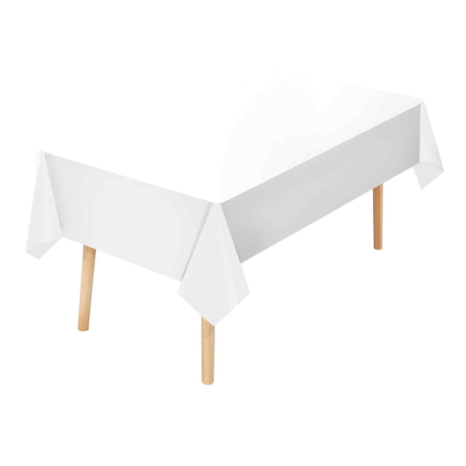
Black and gold: three different products under one word
In plastic, gold is produced in three ways, and they are not interchangeable. The first is a pigmented film, where the resin is coloured through with a gold-toned masterbatch. The second is a metallic or foil-look print laid on top of film, which gives a sharper sheen but lives and dies by ink adhesion. The third is gold printing on a clear film, where the film’s own transparency lightens the shade on the table.
The practical trap is that a yellow-brown that looks convincing under factory lighting can read as plain yellow in a warm banquet hall. Approval should never happen on a phone screen. Agree a master sample, agree the light source you will judge it under, and keep both. The same discipline applies to black: a glossy black film reflects the room and can look grey next to a matte black napkin, even though both are described as black.
Black and white: when the colour is also a pattern
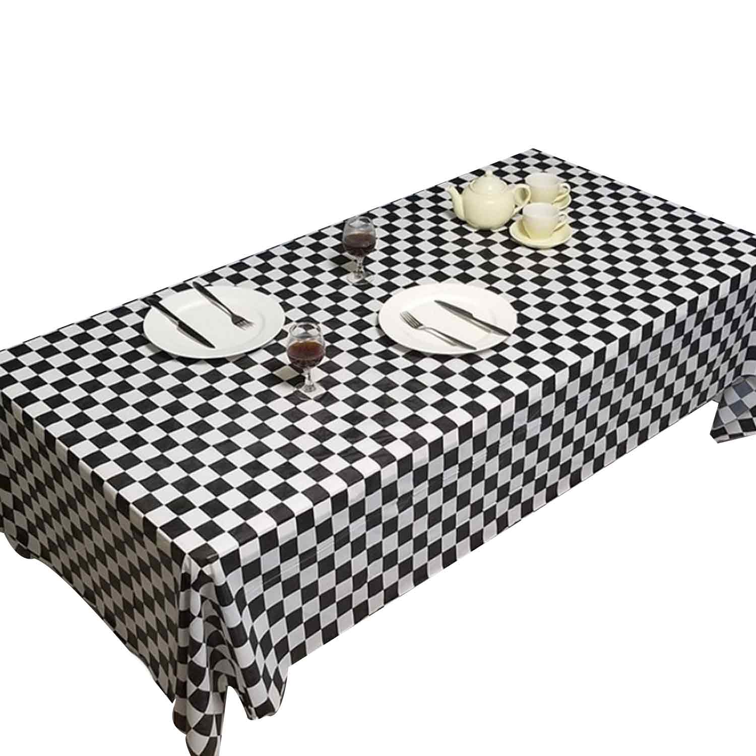
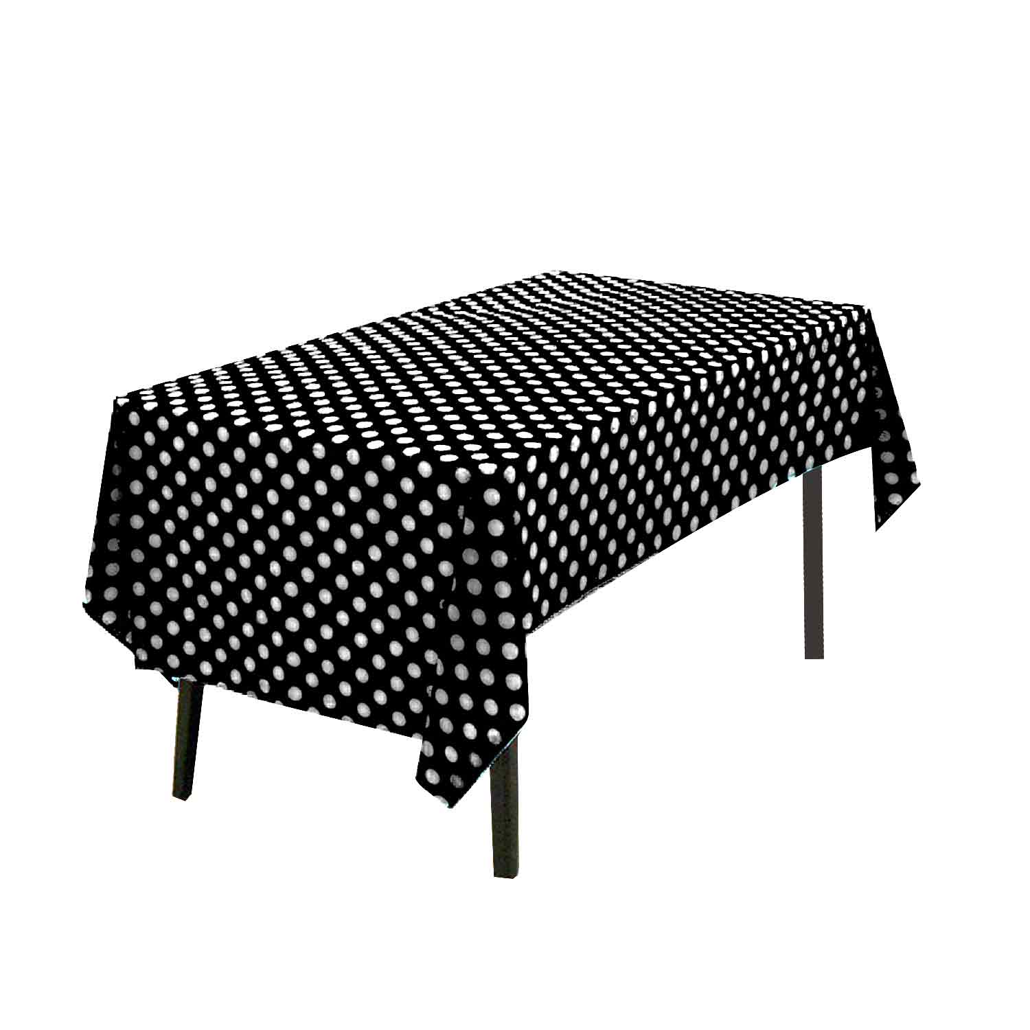
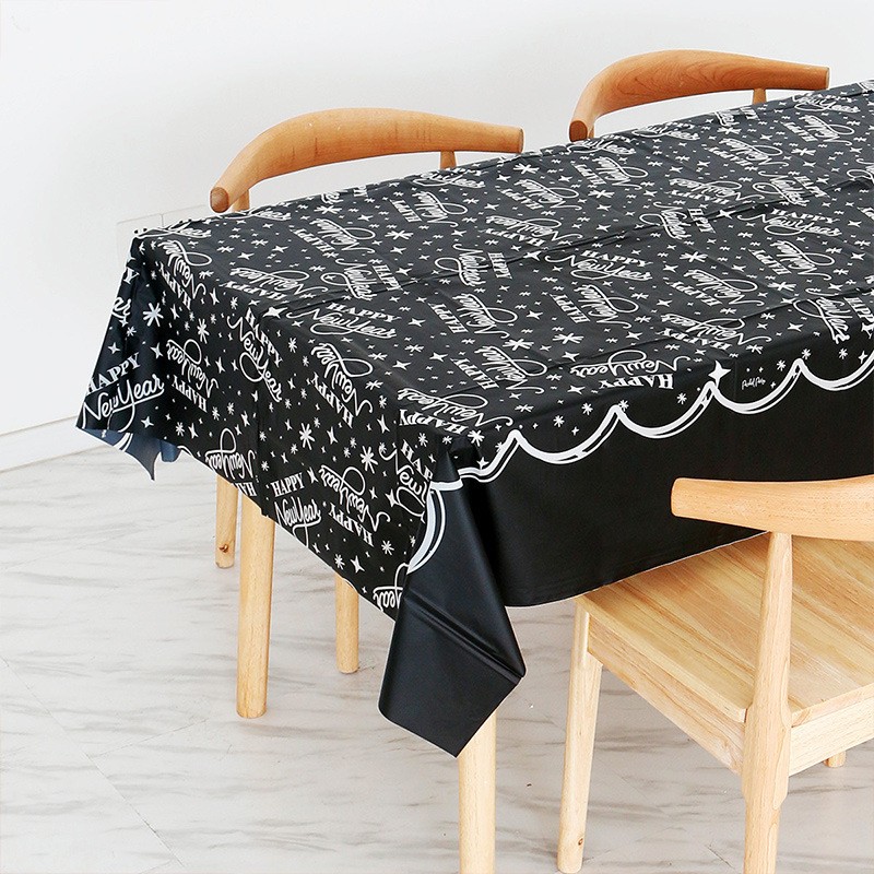
Black and white is unusual because it sells as both a solid colourway and as a print. Solid black covers and solid white covers are stocked as separate items. The pattern versions – checkerboard, polka dot, script and seasonal prints – are printed film, and they need a different conversation.
On a two-colour print, one of the two “colours” is often the unprinted film showing through. That means the white in a checkerboard depends on the film’s own whiteness and opacity, not on a white ink. If the next production run uses a slightly different film lot, the pattern changes even though the ink has not. The black ink side introduces the familiar print variables: registration between the two colours, ink adhesion, and rub resistance at the folds and at the cut edge. Ask for the printed film to be checked after folding, not only flat off the press – the fold line is where ink fails first.
Write the shade as a number, not a word
Colour difference is measured as Delta E, the distance between a sample and a reference in a uniform colour space. The convention behind the scale is that a difference of 1.0 was intended to represent a just noticeable difference, although that assumption has been revised over time – the CIE76 threshold was later put closer to 2.3. The formula and its history are set out on the colour difference reference page, and the instrumented method for turning measured colour coordinates into a tolerance is covered by ASTM D2244.
Two things follow for a purchase order. First, a tolerance has to be written down and tied to a physical master sample, signed and dated by both sides, with the measurement method named. Second, the light source has to be named too. Two colours can measure identical under one illuminant and visibly differ under another – metamerism, explained here. “Match under the venue’s warm light” and “match under daylight” are different specifications, and a supplier cannot guess which one you meant.
The substrate changes the shade before the ink does
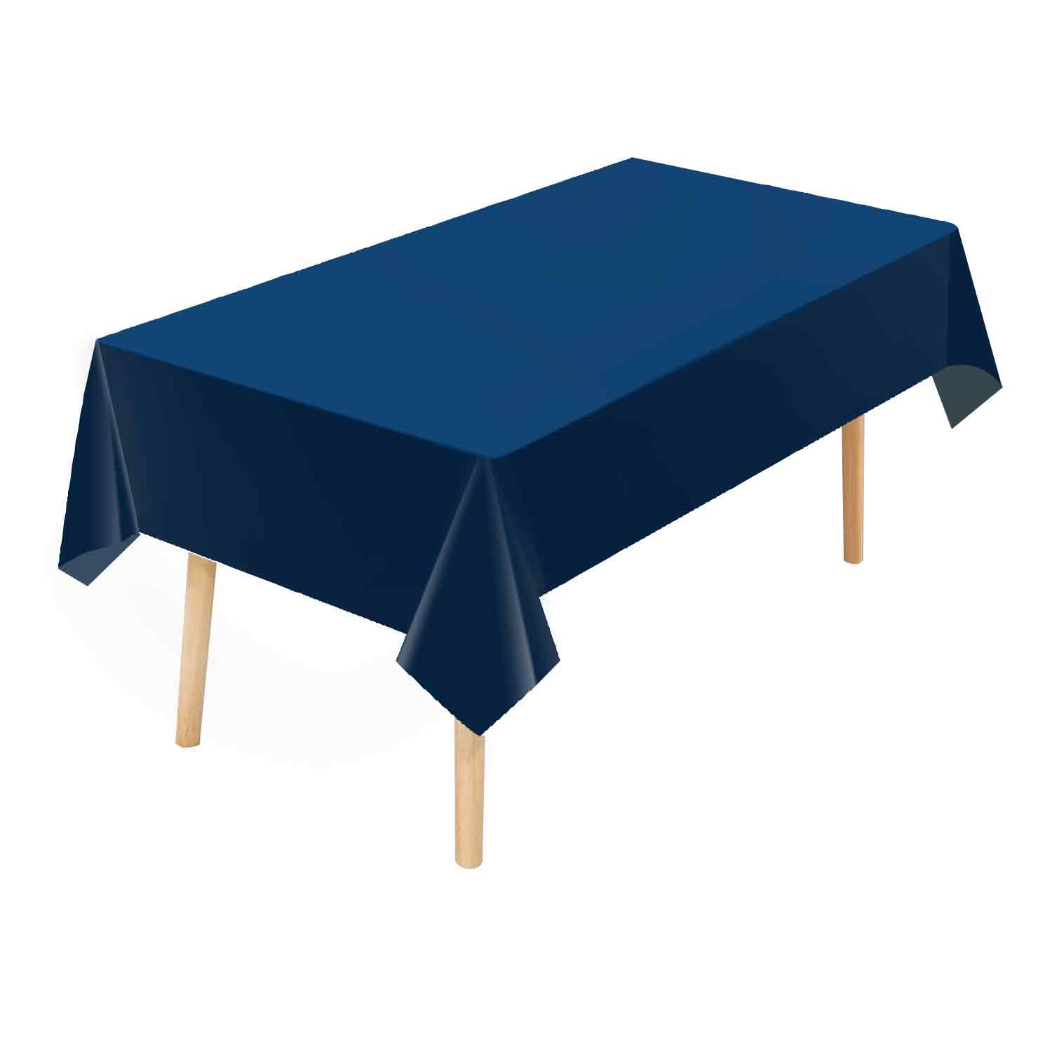
Buyers often assume a colour code travels between materials. It does not. The same gold masterbatch reads differently in PEVA, in PVC and in a polypropylene film, because the base resin, the opacity and the surface finish all change how light behaves at the surface. A matte finish scatters light and mutes a shade; a gloss finish reflects the room and lifts it. Thickness matters too: a darker shade on a thin film can look washed out under a table light, where the same shade on a heavier film holds.
So the specification should name the material and the gauge alongside the colour, not just the colour. Our own comparison of PEVA, PVC and vinyl tablecloth materials and the guide to thickness in mil, micron and GSM explain how those choices change the finished cover, and the production walk-through from resin to printed roll shows where colour is actually introduced into the line.
Food-contact colourants are a closed list
If the cover or the tableware touches food, the colorant is regulated, not just aesthetic. In the United States, colorants for polymers used in food contact are drawn from the permitted list in 21 CFR 178.3297; in the European Union, colourants sit inside the food-contact framework summarised by EFSA. A colour that is perfectly saleable for a decorative backdrop may be the wrong grade for a surface handling sandwiches.
Practically, ask for the colorant declaration with the quotation, and test the thing that actually gets complained about: colour transfer. Press a white napkin, a plate rim or a damp cloth against the printed or pigmented surface and check that nothing comes away. Rub-off at the fold line is a colour failure even when the shade itself is correct.
Light, heat and storage move the colour over time
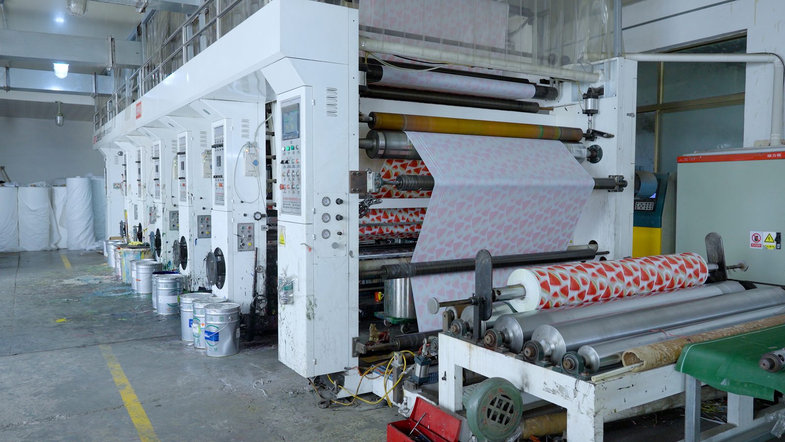
Colour fastness is the reason a carton approved in spring can draw complaints in autumn. Lightfastness, the resistance of a colour to fading under exposure to light, is a standard concern for coloured polymers and printed film, and it is measured rather than assumed – see the overview of colour fastness and the testing discussion from a colour fastness testing laboratory. Printed film is normally produced by flexographic printing, where the ink is transferred from a cylinder onto the moving web – the process is described in the flexography reference – and ink systems differ in how they hold up outdoors.
Storage follows the same logic. Rolls and cartons kept in direct sunlight, or in a hot container for weeks, will show the outermost layer shifting before the core does. If shade consistency matters for the season, keep stock out of direct sun, rotate it, and re-check the outer wrap against the master sample before shipping. The same discipline sits behind our note on the spec fixes behind common tablecloth complaints.
The colour specification sheet
One page is enough. If these lines are on the enquiry, the shade conversation usually disappears:
| 1 | Colour name plus an internal code – never “gold” alone |
| 2 | Master sample: signed, dated, one copy held by each side |
| 3 | The illuminant the sample will be judged under |
| 4 | Delta E tolerance and the measurement method (ASTM D2244) |
| 5 | Material, thickness in micron or mil, and finish – matte or gloss |
| 6 | For prints: number of inks, registration tolerance, rub and adhesion check |
| 7 | Colour mix per carton – sorted by colour, or mixed, and labelled accordingly |
| 8 | Acceptable quantity tolerance per colour on short runs |
Point seven is the one buyers most often forget, and it is the one the warehouse feels. A carton that mixes five colours saves packing cost and costs picking time; a carton sorted by colour costs a little more and moves faster. Neither is wrong, but the choice has to be stated.
Matching one colour across a whole table setting
The last question is the hardest: making a tablecloth, a napkin, a plate and a piece of cutlery agree on “black”. They will not agree by default, because the materials are different and the light behaves differently on each. Pick one item as the lead – usually the tablecloth, because it has the largest surface area – and match everything else to it. Our guide to colour matching across napkin sizes and plies and the plates and bowls sizing guide follow the same principle, and the seasonal stock list for Halloween and Thanksgiving tableware shows how colour sets are grouped for a season.
Ordering by colour
Colour is one of the few specification lines that costs nothing to define and a great deal to get wrong. Name the shade, keep a sample, name the light, and put the material and gauge next to it. If you are consolidating a seasonal programme and want to see how a colourway runs across covers, rolls and tableware, send the shade reference with your quantity breakdown and we will quote against the same sample. Start from our plastic tablecloth range or go straight to how we quote.
Related reading: size chart for round and rectangular tables | rolls versus pre-cut covers | reading a tablecloth quotation | printed tablecloths for the holiday season | contact our team.